
A REFRESHED new-look logo is set to provide a new image for Gannawarra Shire Council.
Council has adopted a new design two decades after the original shire logo was designed to coincide with the amalgamation of the former Shire of Cohuna and Shire of Kerang.
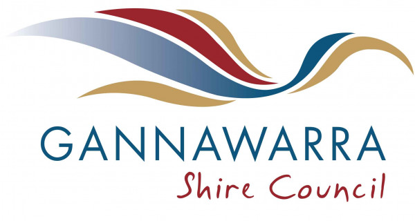
Gone is the large “G” overlayed witha realistic line drawing image of an ibis.
In its stead is a stylised ibis and the council’s name.
Shire chief executive officer, Eric Braslis said that the new logo and the associated branding designs and developments will provide new energy and impetus for council.
“Rolling the new look out in the manner proposed will not incur any significant costs to council over and above its normal operational budgets,” he said.
Council was told that the refresh of the logo will modernise council’s identity while still providing a clear visual link to the existing brand maintaining the key components and colours. The key logo elements (the ibis) will be stylised and placed with a modern font to create a strong, focussed design that will assist in repositioning council.
“The existing corporate colours will remain, but include the addition of a yellow,” he said.
“The proposed refresh of the logo will provide more options for enhancing community perception of council as a progressive, professional, innovative and responsive organisation.”
Mr Braslis stressed that the logo rollout will be implemented as a forward process, not retrospectively, meaning it will only be applied to new signage and new projects and as part of council’s natural lifecycle replacement program.
“All signage and existing projects will retain the existing logo until replacement becomes necessary due to other issues such as natural deterioration or revision,” he said.